UI and UX
Google’s Material 3 Just Made UX Personal—Here’s Why That Matters
Share
Overview
Design has always been about more than just what looks good—it's also about what feels right. The colors we gravitate toward, the layouts that just “click,” and the tiny interactions that somehow make a screen feel human. As users, we may not always notice it, but design shapes our emotional response to every tap, swipe, and scroll.
Also, emotions? They’re unpredictable, deeply personal, and often the invisible layer beneath our digital experiences.
The 2015 movie Inside Out explores this concept in a clever way. If you have seen this animated movie, you know that the film doesn’t just show emotions as characters—it also shows how each emotion frames our perception.
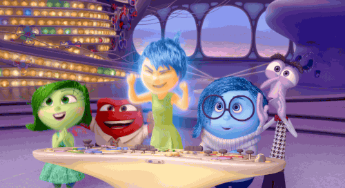
Riley (the protagonist) doesn’t just react to the world around her; she experiences it through Joy’s glow, Sadness’s softness, or Fear’s sense of caution. Her actions, words and behavior bends to her inner state.
Now, bring that concept into design.
What if your interface didn’t just exist, but responded to emotions? Not in a robotic, rules-based way—but with an awareness of users' preferences, habits, and even emotional tone. That’s exactly what Google’s Material 3 (M3) is inching toward.
Rather than delivering a one-size-fits-all UI, Google just dropped the mic with its M3 expressive design update. So, are you wondering what this design system is all about?
Let's get started!
What Is Google's Material 3?

Material Design 3 (M3) is Google’s latest design system, with Material You as its Android-specific flavor to bring UX personalization to Android smartphones. It focuses on making interfaces feel personal, adaptable, and expressive. Leaked ahead of its official debut at Google I/O 2025, M3 Expressive is already turning heads.
It builds on the previous Material Design system, aiming to make our digital lives easier and interactions prettier. Its key features include:
-
Dynamic Theming: M3 takes personalization to the next level, so you smartphone’s color scheme adapts to your wallpaper, creating a cohesive, unique look.
-
Accessibility Improvements: M3 is designed with everyone in mind. Android devices can cater to specially abled people with special needs now that the brightness ratios and touch targets are bigger. Google's accessibility report says that these changes make technology open to everyone.
-
Visual Consistency: M3 ensures that the look and feel is similar across systems, such as your smartphone, tablet, or even a web browser.
-
Typography: M3 introduces updated type scales and variable fonts, enhancing readability and expressiveness. Think bolder headlines and smoother body text that adapt to your screen size, making every word pop.
-
UI Components: M3's components, like those in the redesigned Google Clock or Gmail, use rounded forms and fun animations. These include boxier floating action buttons (FABs), updated navigation bars, dialog modals, and more.
Material 3 isn't just about aesthetics but creating a user-friendly, accessible and interactive experience for everyone. It aims to make technology feel less like a tool and more like an extension of yourself!
So, is M3 just another design fad, or does it have the potential to change how we interact with our devices? Let's explore how it affects various user groups.
M3's Impact On Different User Demographics
M3 isn't just a fresh coat of paint, you know. Think of it as the UX equivalent of a perfectly tailored suit, but for your devices. So, how does this play out across different age groups and abilities?
After all, Google's M3 aims to bridge the digital divide. For Gen Z, who've grown up with personalized content, M3's dynamic theming feels natural. It's like having a smartphone that changes its vibe to match your latest playlist. For older generations, Google’s 46 studies with 18,000+ users show M3’s larger buttons and bold contrast make it a win for all ages. In fact, users over 45 spotted key UI elements just as fast as younger ones!
Accessibility isn’t a bonus—it’s a must. M3 makes sure that everyone has a great experience, no matter their skills, by following standards like WCAG (Web Content Accessibility Guidelines).
M3's expressive design makes a brand feel more relevant and "in-the-know." Google's research indicates a 32% increase in subculture perception with expressive design. It also saw a 34% boost in modernity, making a brand feel fresh and forward-thinking.
It's like your favorite brand suddenly knowing all the cool slang, but does this mean other brands should just chase this trend?
Well, M3's power comes from its ability to make a personalized UX that works for a wide range of users. The goal is to make technology feel more like a part of us and less like a tool. This is what makes UX customization important: it gives you power to shape experiences.
With that in mind, let's explore how this design system compares to the popular ones!
Comparative Analysis: Material 3 Vs. Competitor Design Systems
So, how does M3 stack up against the competition?
Apple's Human Interface Guidelines (HIG) are a major player, known for its polished, native iOS feel. Yte, does it offer the same level of personalization as Material 3?
Our hot take? M3 shines with its dynamic theming, letting users tweak their interface to vibe with their style. It’s a level of customization that HIG, despite its sleek but less flexible UX, doesn’t quite match.
Microsoft’s Fluent Design System brings some heat, with light and motion creating a sense of depth, while IBM’s Carbon Design System nails enterprise-grade consistency. Although M3’s focus on emotional design makes it feel like your device has a personality.
Here’s how M3 stacks up against the big players:
|
Feature |
Material 3 |
Apple's HIG |
Microsoft's Fluent |
IBM's Carbon |
|
Personalization |
High (dynamic theming, adaptive colors) |
Low to medium (dark mode, limited theming) |
Medium (theming options, accent colors) |
Medium (theming for enterprise) |
|
Cross-Platform |
Android, Web, Flutter |
Apple platforms only |
Windows, Web, and some Mobile |
Primarily Web |
|
Accessibility |
Strong (WCAG-compliant, inclusive) |
Strong (robust iOS features) |
Strong (assistive tools) |
Strong (enterprise focus) |
|
Emotional Design |
Explicit (vibrant, expressive) |
Implicit (elegant, minimal) |
Via motion and depth |
Functional, less expressive |
As mentioned in the table, M3 aims for consistency across Android, browsers, and even Flutter apps. That’s a big win for developers, cutting down on those “why does it look weird on this platform?” headaches. Plus, its accessibility features, like high-contrast elements and larger touch targets.
Material 3 has a key differentiator: its focus on emotional design. It's more than making things look pretty; it's about creating interfaces that feel more human, responsive to individual needs, and engage users.
Although the M3 is under development and has some downsides, its flexibility is awesome. The potential to create truly personalized, accessible experiences makes M3 a heavyweight contender in the design system arena.
Ready to give this vibrant UI a spin? Let’s see how to make it happen!
Implementing Material 3 In Your Projects
So, you're ready to jump into the world of M3? Awesome!
So, how do you actually do it? Let's break it down.
First off, designers and developers need to work together, like Batman and Robin, but with less brooding. Designers can start by exploring the latest trends in Material Design 3. Google provides a bunch of tools to make this easier. Think of it as getting a cheat sheet for a test you didn't study for (but in a good way!). Here they are listed:
-
Material Theme Builder: This is where you'll work with your themes. Change the fonts, colors, and shapes to make them fit your brand. You can also play with dynamic colors that adapt to users, a hallmark of M3 Expressive.
Source
-
Code Components: Google has code components for Android, Flutter, and the web that are already built and ready to use. These parts are made to be a flexible UI, which will save you a lot of time and work, so you don't have to reinvent the wheel when you can use Google's.
-
Design Tokens: These are numbers that stand for things like color, spacing, and font size. Using design codes makes sure that your whole project is consistent. Think of it as giving your design and development teams a common language!
Using Material 3 isn't just about how it looks; it's also about making the experience flow well and be easily usable. By using M3's tools and resources, teams can improve their workflows and designs to make apps that look good and function better.
Now this part is for the Figma fans!
Luckily, Google provides a Material 3 Design Kit in the Figma Community.

-
Locate The Kit: Head over to the Figma Community and search for "Material 3 Design Kit." Make sure it's the real Google one (or just click the link above!).
-
Duplicate It: Once you've found the kit, make a copy of it in your Figma account. This makes a copy that you can change without changing the original.
-
Customize Themes: The kit comes with styles and parts that are already set up, but you can change them to fit your brand. To make something look and feel different, change the fonts, colors, and space. It's like making over your app.
-
Sync With Live Components: To sync your visual designs with live app components, use design codes to ensure that your drawings are always up-to-date and match the code. This gives you real-time collaboration capabilities between design and development.
So, what are you waiting for? Dive in and start experimenting with dynamic themes, expressive layouts, and personalized experiences.
If you want to use M3 in your projects, now is the best time to begin!
Wrapping It Up
That's all there is to it, folks!
Google's M3 Expressive gives your apps a new look, and it's all about making user experiences feel more personal, dynamic, and interesting. Google's study backs it up!
This new design aims to make your Android experience not only useful but also fun, whether you're a parent handling routine tasks or a student trying to keep up with homework.
So get ready for a design that is more colorful, expressive and tailored to fit your style. I had no idea UX could be so much fun!
Frequently Asked Questions
What Does "Material You" Mean In Google's Design System?
Material You is Google’s design philosophy that prioritizes personalization. Introduced with Android 12, it adapts UI elements—like color, shape, and typography—based on user preferences, wallpaper, and device context, making digital experiences more expressive and user-centric.
Is Material You The Same As Material 3?
Material 3 is the technical name for the latest version of Google’s design system, while “Material You” is its user-facing concept. In essence, Material 3 powers Material You, combining flexible design foundations with a personalized, emotional user experience.
What Is The Material 3 Design System?
Material 3 is Google’s most advanced design system update, featuring dynamic theming, responsive components, enhanced accessibility, and support for both Android and web. It enables designers to build interfaces that are adaptive, expressive, and consistent across platforms and screen sizes.
Wed, May 14, 2025
Enjoyed what you read? Great news – there’s a lot more to explore!
Dive into our content repository of the latest tech news, a diverse range of articles spanning introductory guides, product reviews, trends and more, along with engaging interviews, up-to-date AI blogs and hilarious tech memes!
Also explore our collection of branded insights via informative white papers, enlightening case studies, in-depth reports, educational videos and exciting events and webinars from leading global brands.
Head to the TechDogs homepage to Know Your World of technology today!
Disclaimer - Reference to any specific product, software or entity does not constitute an endorsement or recommendation by TechDogs nor should any data or content published be relied upon. The views expressed by TechDogs' members and guests are their own and their appearance on our site does not imply an endorsement of them or any entity they represent. Views and opinions expressed by TechDogs' Authors are those of the Authors and do not necessarily reflect the view of TechDogs or any of its officials. While we aim to provide valuable and helpful information, some content on TechDogs' site may not have been thoroughly reviewed for every detail or aspect. We encourage users to verify any information independently where necessary.
AI-Crafted, Human-Reviewed and Refined - The content above has been automatically generated by an AI language model and is intended for informational purposes only. While in-house experts research, fact-check, edit and proofread every piece, the accuracy, completeness, and timeliness of the information or inclusion of the latest developments or expert opinions isn't guaranteed. We recommend seeking qualified expertise or conducting further research to validate and supplement the information provided.
Loading comments...